Asset Class CAPM
CAPM doesn't work within equities, but does it work across asset classes?
By: Daniel Rasmussen & Chris Satterthwaite
We have written before about the thorough empirical failure of the Capital Asset Pricing Model within stocks—and the surprising success of low-volatility equity strategies.
CAPM suggests that stock returns should rise linearly with volatility. But chart equity returns against volatility and you’ll see a scatter plot—indeed, the best-fit regression line that runs through the scatter in fact slopes downward.
But while we believe CAPM has no business being used as a model for understanding stocks, we do see the core insights of the model hold across asset classes. More volatile asset classes do generally have higher returns, while less volatile asset classes have lower returns.
Below, we show where various asset classes lie on the risk-return spectrum. We focus on the US market alone as an illustrative example for simplicity.
Figure 1: Asset Class Real Risk and Return (1973–2023)
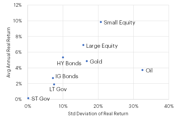
Source: Verdad analysis, Capital IQ, FRED, Ken French Data Library, MacroTrends, Fidelity
As shown above, there is a general gradient of risk and return along which most asset classes can be plotted. Toward the bottom left (lowest risk and lowest return), we have a range of fixed-income securities, ranging in degree of risk/return from short-dated government bonds to high-yield bonds. Then we have equities, which are similarly graduated from large-cap US stocks (safest) to small-cap US stocks (riskiest). Oil seems to be the exception to the CAPM line, exhibiting very high volatility and relatively low returns.
Given that most of the assets above lie on a similar best-fit line from the origin, we can also conclude that most asset classes have approximately similar Sharpe ratios (return divided by risk). This is important from our analysis—it means an investor may not achieve higher risk-adjusted returns by simply allocating to asset classes that generate higher returns.
We believe investors can achieve higher risk-adjusted returns by combining asset classes and achieving the benefits of diversification. But, as we noted earlier, these benefits come at the cost of total return, given the return advantage equities have over other asset classes. When thinking about combining asset classes, we need to understand their long-run correlations. Below we show how these various asset classes have been correlated over long periods of time.
Figure 2: Asset Class Return Correlation (1978–2023)

Source: Verdad analysis, Capital IQ, FRED, Ken French Data Library, MacroTrends, Fidelity
Notably, long-term government and investment-grade corporate bonds are highly correlated and tend to respond similarly to changes in inflation. High-yield bonds and equities (large and small) are quite correlated and tend to be more responsive to changes in GDP growth. Finally, commodities (oil and gold) have relatively low correlation with each other or with other asset classes. The one exception is the notably low correlation with long-term government bonds. Oil tends to be pro-cyclical and a good inflation hedge while long-term government bonds tend to be countercyclical and do well when inflation is falling, so we would expect a negative correlation here. These correlations, of course, oscillate across the business cycle, but the long-term relationships are still useful to understand.
The CAPM might be useless for choosing stocks, but as a general framework for guiding asset allocation, the model does provide a good framework for understanding the opportunities and trade-offs investors face.