Sclerotic Small Caps?
Measuring Market Cap Migration Over Time
We’ve heard much consternation about potential structural changes among small-cap equities and what it may imply for the small size premium going forward. One explanation we explored was the decline in the quality of the small-cap cohort, most notably via the influx of lower quality companies. A separate question we’ve received has been whether the small-cap universe has become increasingly rigid, resulting in lower upward migrations into the mid- and large-cap universes.
To examine this question, we classified companies into small cap (<70th percentile market cap), or medium/large cap (>70th percentile market cap) by region, by year and analyzed the percentage of companies that migrated up from small cap to medium/large cap. Those that did not migrate up either remained small cap or exited the universe because they delisted or were acquired. For context, the 70th percentile market cap in the US today is roughly $2B and the 90th percentile market cap is $10B, per Capital IQ.
Starting with the US, we looked at the annual rate of migration from our small-cap universe definition over the 20 years since 2004.
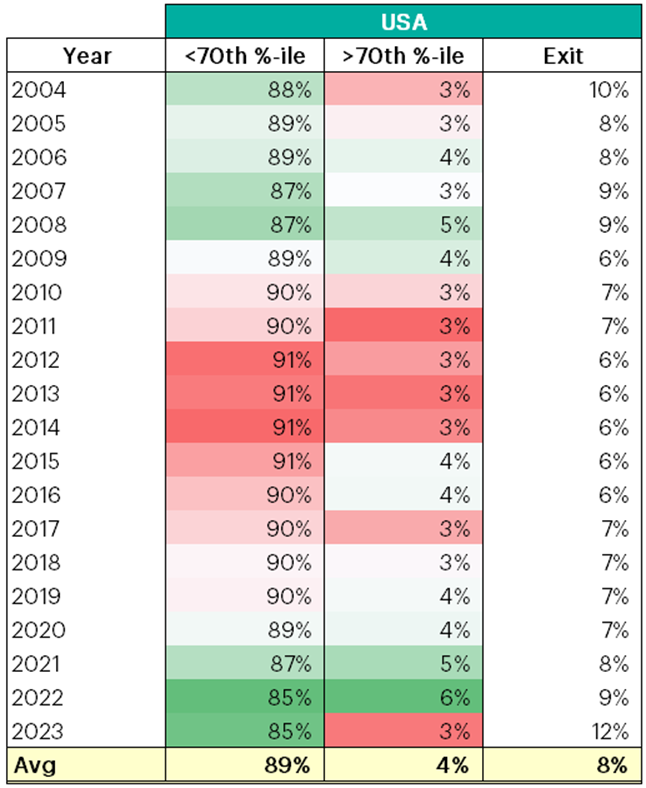
Figure 1: US Small-Cap Migration Rate over 1Y
Source: Verdad analysis, Capital IQ
The upward migration for US small caps over the last 20 years has averaged 4%. Instead of a decrease in upward mobility, we see a gradual uptick from 3% to above 5-6% during the SPAC mania of 2021/2022. If anything, this would suggest that the upward mobility of small caps has in fact increased slightly within the US, with 2023 as an exception.
That being said, the proportion of companies that move up each year is small. Close to 90% of small-cap companies remain small cap a year later, with roughly 8% exiting the universe. Returns to small caps broadly will be defined by what happens in that 90% and the buyout versus delisting mix in the exiting 8%.
While the rate of upward migration out of small caps hasn't changed materially within the US, it is interesting to compare the US to other regions. The chart below shows the same analysis for Europe, Japan, and Emerging Markets.
Figure 2: International Small-Cap Migration Rate over 1Y

Source: Verdad analysis, Capital IQ
Notably, Japan has the most persistence among small caps, with 94% remaining small cap a year later, while on average only 3% migrate into mid cap and large cap. However, Japan also has the lowest exit rate among small caps at 3%.
Meanwhile, Europe looks much like the US, with a persistence rate of 90%, an upward migration rate of 3% and an exit rate of 7%. With the data we have available, we can’t say what portion exit via M&A and what portion delist.
In aggregate, we couldn’t find significant evidence that upward mobility among small caps is meaningfully lower than it has been historically. The mix of M&A versus delisting in small-cap companies that exit the universe could tell a different story. But, for the most part, the percentage of companies that remain small cap a year later is relatively comparable across time and across geographies at around 90-95%.
We think the changing composition of industries and quality among the small-cap universe is more to blame for weaker recent returns to small caps rather than a structural change in the upward mobility for small-cap equities.