Navigating Turbulence
Using historical precedents as a roadmap for allocating assets today
By: Chris Satterthwaite and Lionel Smoler-Schatz
Last week the S&P 500 tipped into correction territory, with a 10% drawdown in less than a month, bringing the year-to-date return for the S&P 500 Total Return Index to an uninspiring -6%.
The barrage of headlines is non-stop. Depending on what and when you read, tariffs are on [off], inflation is accelerating [slowing], a recession is imminent [nonexistent], and wars are escalating [stopping]. Either way, volatility is elevated across the board. It’s practically impossible for investors to make heads or tails of what is happening and how their portfolios should be positioned.
We believe the best way to predict the future is to look at the base rates of history. Building on some excellent recent papers, we have developed our own methodology for measuring how similar today’s macroeconomic conditions are to history, using a range of our favorite signals like the high-yield spread, inflation, and stock-bond correlation. We call this “M-Distance,” where M stands both for “macroeconomic” and for the statistician Mahalanobis, who invented the method. The chart below shows how the current macroeconomic conditions compare to history.
Figure 1: M-Distance Analogues (Higher = More Similar)
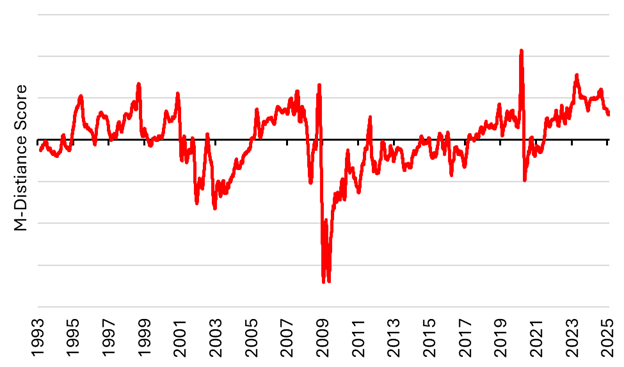
Source: Verdad analysis
This chart measures both relevance (how similar the macroeconomic conditions were) and informativeness (how “unique” those macroeconomic conditions were). From this, we can see that today’s macroeconomic conditions look most similar to Q1 2023 (Silicon Valley Bank collapse), Q1 2020 (COVID), the period leading up to and the start of the 2008 financial crisis, and the 1990s tech bubble. These seem like ominous analogues, but it’s worth noting that this method doesn’t just find the final months before the crashes similar, but also periods in the booms that preceded them. We can look at the individual signals that are most comparable below.
Figure 2: M-Distance Signal Comparison (Z-Scored)
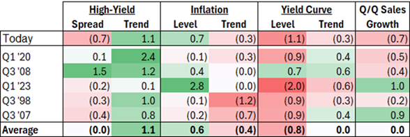
Source: Verdad analysis
The most notable commonalities are rising high-yield spreads (signaling increased risk aversion and volatility), above-average and cooling levels of inflation, and a flat or inverted yield curve. The Q/Q sales growth signal is a little more mixed, but, excluding the boom periods of ’23 and ’07, sales growth has a slight negative trend.
While these historical macroeconomic analogues can provide context, they don’t give us the full picture. Volatility of asset classes and the correlations between them are also highly dynamic and can change significantly over time.
Figure 3: 6M Correlation of 10Y US Treasurys to S&P 500 and 6M S&P 500 Volatility
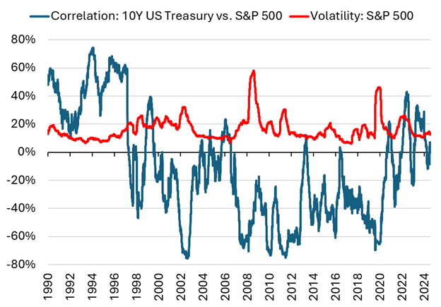
Source: Bloomberg, Verdad analysis
Fortunately, volatility and correlations tend to exhibit autocorrelation (unlike returns), so often our best estimate of future volatility and correlations are extrapolated from recent history. We can build volatility forecasts based off trailing volatility, and, informed by our M-Distance historical analogues, we can construct correlation matrix forecasts by blending a faster- and slower-moving correlation matrix. This allows us to capture quickly changing correlation dynamics while retaining slower-moving structural relationships between asset classes.
This sort of dynamic volatility and correlation forecasting is essential to building portfolios. If volatility increases and our return forecasts do not similarly decrease, our portfolio should reduce net exposure. Similarly, if correlations between asset classes start to increase, our portfolios should also reduce net exposure, as the benefit of owning diversifying assets decreases.
We can use M-Distance based on comparable historical periods to inform our expected return forecasts for asset classes, with the presumption that different assets classes perform better or worse in different macroeconomic conditions.
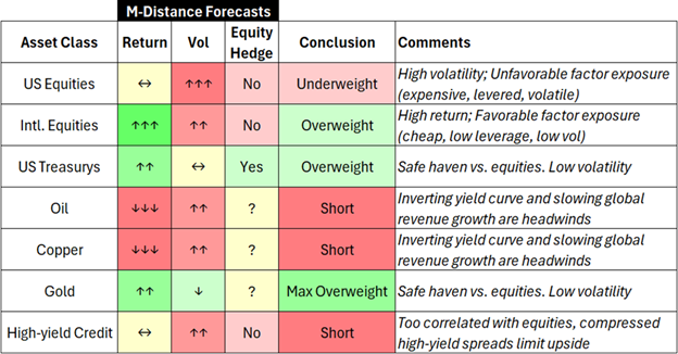
Equipped with our return forecast, volatility forecast, and correlation forecast, we can examine the relative risk-to-reward ratio of high-level asset classes and how they compare to longer-term averages. For indices, we compute the weighted average factor exposure and make our predictions based off the risk-factor exposures inherent in each index. For instance, US equities skew larger and more expensive versus international equities.
Figure 4: M-Distance Weighted Return, Volatility, and Sharpe Forecast
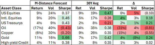
Source: Verdad analysis
Relative to a 30-year average, our current M-Distance weighted forecast based on similar prior analogues is relatively bullish on US Treasurys, bearish on oil and copper, bullish on gold, and neutral on high-yield credit. Our outlook for US equities is worse relative to their 30-year average (+9% vs. +9%), but for international equities, our outlook is better relative to their 30-year average (+9% vs. +5%). We also see higher volatility for US equities versus international equities. Our difference in the view for US versus international equities is driven by the relative style-factor differences between the regions, with international markets skewing cheaper, with higher dividend yields, lower volatility, and lower leverage than US equities.
The final necessity for translating this outlook into an optimal portfolio is considering expected correlations. Below we show our best forecast of the current correlation matrix between these asset classes (using a blend of a slow-moving and fast-moving correlation matrix) and the long-term average correlation matrix for comparison.
Figure 5: Asset Class Correlation Matrix
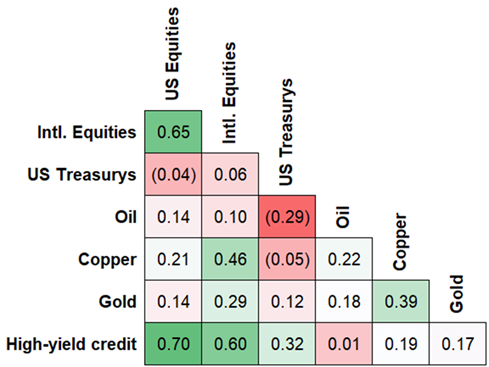
Source: Verdad analysis
US and international equities are obviously highly correlated. Going long US Treasurys and gold, or short oil and copper, offer diversifying exposures.
Integrating our return, volatility, and correlation forecasts, we can build the rough outline of a portfolio best suited for today’s environment, based on historical analogues.
Figure 6: Portfolio Construction Implications
Source: Verdad analysis
This portfolio is notably different from what most investors currently own (the S&P 500, with maybe a smattering of Europe in the last week). While equities have been the bulwark of investor portfolios for decades, times of rising volatility and uncertain return expectations make the appeal of diversifying assets more salient. Being able to express a view either long or short across asset classes, or within asset classes to target specific factor exposures, can be a powerful tool to increase returns while decreasing volatility.
For instance, while our return forecast for US equities is relatively unchanged versus the 30-year average, this is not true for all US equities. Within US equities we are much more optimistic on defensive sectors and factors (value, quality, low leverage, good momentum), and much more pessimistic on equities with unattractive style exposures (expensive, high leverage, high volatility), where we would selectively look for single-name shorts to further reduce volatility.
While the example outlined above offers a high-level approach to building a diversified portfolio, the same framework can be expanded to regions, sectors, and style factors using individual equities and bonds. Combining factor-targeted single names with diversifying asset classes like commodities and currencies can provide an even more powerful way to build diversified, high-return, low-volatility, and uncorrelated portfolios.
We believe the lessons of history are the best roadmap we have for navigating today, and we have designed our M-Distance measure to provide quantitative clarity and guidance in times of uncertainty. We have long beaten the drum about the value of diversification and believe last week’s US equity market performance should prompt investors to think carefully about portfolio construction and diversification beyond US equity markets, and beyond equities more generally.