Inflation & Lost Decades
Avoiding the Busts in Boom-and-Bust Periods
By: Verdad Research
US inflation reached 7.9% in February 2022. These are, without doubt, unprecedented times in the lifespans of most in the investment community. But these are not unprecedented times in economic history, not even in recent history. The last time inflation hovered around this level was 40 years ago during the 1970s hyperinflation. Before that, there were similar levels of inflation in the 1940s, during and after World War II. More interestingly, the concentrated periods of extreme inflation hikes like we are seeing today, which we define as monthly inflation of more than 50bps (i.e., in the top decile historically), have happened as recently as the 2000s. So what does history tell us about equity performance in such times?
To answer this, we started by breaking down real returns of the S&P 500 by five-year periods and overlapping them with average inflation measured during those periods. We highlight the “lost” decades, defined as decades when the S&P 500 had negative real returns.
Figure 1: S&P 500 Annualized Real Returns and Average Annual Inflation Measured (1955–2022)
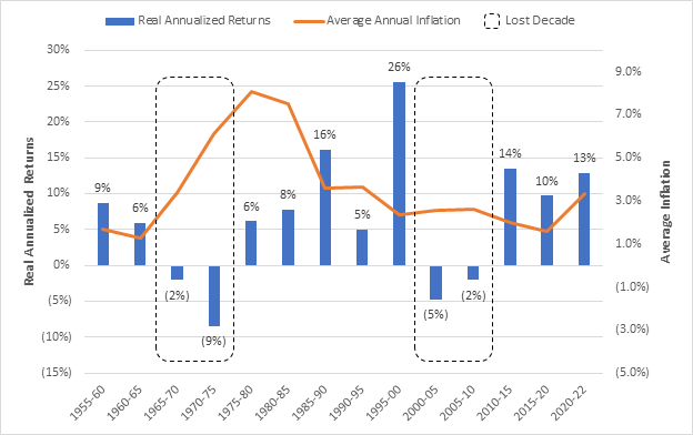
Source: Capital IQ, FRED, Verdad
S&P 500 returns were meager in periods of high inflation. Most importantly, the “lost” decades (1965–1975 and 2000–2010) are characterized not only by high inflation but also by rising inflation compared to previous periods. This is in line with research showing that asset performance is driven by the change in inflation (i.e., is it accelerating or slowing down), rather than its absolute levels, and that equities tend to do poorly in such environments.
What does this say about equities today? The above may not be a good omen for buy-and-hold equity returns, but that does not mean that investors should not be exposed to the asset class. You see, the lost decades were not characterized by a linear pattern of sustained equity losses, but rather a roller coaster when periods of growth were interrupted by periods of sudden crashes.
Below we show the average run from the trailing twelve-month trough to the next 12 months’ peak (bottom-to-top movement) and average drawdowns from the trailing 12-month peak to the next 12 months' trough (top-to-bottom movement). We also highlight the “lost” decades.
Figure 2: Average Top-to-Bottom and Bottom-to-Top Moves (1955–2022)
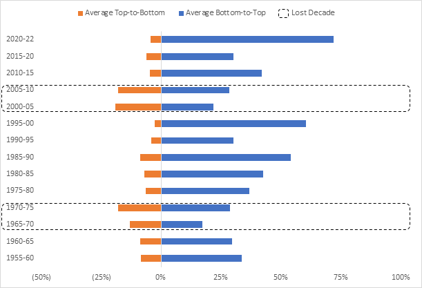
Source: Capital IQ, FRED, Verdad
The lost decades indeed seem to have lower short-term runs (i.e., bottom-to-top moves). Equity recoveries, albeit short term, in lost decades are 40% lower than the average in periods with positive S&P 500 real returns. The standouts here, however, are average short-term crashes (i.e., top-to-bottom moves), which were 2.5x deeper in lost decades. In other words, equities go through growing stretches even in “bad” times; they just tend to crash much more.
To make this more tangible, below we show the evolution of $100 invested in the S&P 500 across the two lost decades, as well as the beginning of the current decade. We highlight the bottoms with drawdowns greater than 20%.
Figure 3: S&P 500 Index Evolution by Period

Source: Capital IQ
Despite meager results, the “lost” decades did see some spectacular growth periods. For example, the S&P 500 in the early 1970s saw a recovery similar to that after the COVID-19 recession, only to crash again afterwards. Those frequent crashes ended up muting previous growth in those periods.
The key to avoiding lost decades, therefore, seems to be the ability to reduce the impact of the frequent crashes. The biggest takeaway for investors seeing high inflation numbers should be to take steps to insulate portfolios from the major drawdowns that often follow.
We’ve been studying quantitative ways to reduce drawdown risk, and we’ve found two signals that we believe are helpful in this regard. The first, which we’ve written about before, is trend following, which basically means getting out of equities when they start to fall. The second, which we wrote about in our piece on Countercyclical Investing, is the slope of the yield curve. Inverted yield curves, when short-term yields are higher than long-term yields, often signal danger ahead.
Trend-following signals buy or sell decisions based on a 200-day simple moving average, which is the most cited standard in academic and practitioner literature. Buy when prices are above their 200-day moving average; otherwise, sell. While it may be counterintuitive to “buy the peak and sell the dip,” this is a risk-off signal aimed at reducing severe drawdowns by being out of an asset when the market turns.
For context, the probability of the S&P 500 falling by 20%, roughly the average top-to-bottom move during the lost decades, or more within 12 months of the “sell” signal is 19%. This is six times higher than the probability of such a fall happening after the “buy” signal is triggered.
Figure 4: Probability of 20% S&P 500 Drawdowns 12M after Trend-Following Signal (1955–2021)

Source: Capital IQ, Verdad
The slope of the yield curve measures the spread between long-duration and short-duration government bonds (we use 10-year and 1-year Treasury yields). It has historically been a powerful indicator of business-cycle stages, steep at the peak and flat at the trough. A flattening yield curve anticipates rising inflation. However, in rare extreme cases, the slope of the yield curve can also invert. These events tend to happen only in periods of high market volatility and tends to precede crises. On average, the curve was inverted 33% of the time during the lost decades (compared to 10% of the time in the decades with positive S&P 500 real returns; since 2010, the curve was inverted only in August and September 2019).
As with trend following, the probability of the S&P 500 falling by 20% or more within 12 months of the “sell” signal is 17%. This is three times higher than the probability that it will do so after the “buy” signal is triggered.
Figure 5: Probability of 20% S&P 500 Drawdowns 12M after Yield Curve Signal (1955–2021)

Source: Capital IQ, FRED, Verdad
We then created a simple composite signal that would be long the S&P 500 only when it is above its 200-day moving average and the yield curve is not inverted; otherwise, it would hold cash (i.e., earning the three-month Treasury yield). Below we compare the real returns of the S&P 500 with and without this signal by five-year periods and highlight the lost decades.
Figure 6: S&P 500 Annualized Real Returns by Strategy (1955–2022)

Source: Capital IQ, FRED, Verdad
The signal could have helped avoid the lost decades by simply being out of the S&P 500, on average, 60% of the time during those periods. For comparison, the signal would have been out of the S&P 500 only 25% during the decades when the S&P 500 has had positive real returns.
As with any insurance-like products, the signal would have slightly underperformed the benchmark in most of the other periods. This is because investors would trade upside capture for downside protection by holding cash roughly one-third of the time. Can investors do better in the remaining periods? We believe the answer is yes: by incorporating the business cycle in investment decision-making.
Investors may be currently facing the risk of a “boom-and-bust” decade. Since its beginning, inflation has been rising in 70% of the months and has now reached its highest levels in the past 40 years. The S&P 500 is trading around its 200-day moving average, while the yield curve is flattening. Despite the S&P 500 being up 40%+ since the beginning of the decade, we have already gone through a bust during COVID-19, albeit followed by a quick reversal. We believe now is a good time for investors to consider drawdown-reduction strategies and their implementation in a broader portfolio context.