The Size Factor
Small caps are trading at the steepest discount to large caps in decades
By: Dan Rasmussen & Brian Chingono
Over the past 50 years, small-cap stocks have returned, on average, about 2% per year more than large-cap stocks, according to Ken French’s data. The inclusion of the small-cap factor to help better explain stock movements was one of Nobel Prize–winner Eugene Fama’s biggest early breakthroughs.
This higher return, though, came with higher volatility. Over the past 50 years, large-cap stocks have had an annualized monthly volatility of 15% versus 21% for small caps, according to Ken French’s data.
Smaller companies have had higher bankruptcy risk (about 18% higher). They also tend to be more sensitive to economic conditions and, as a result of lower trading liquidity, experience bigger price swings. In theory, investors should be compensated for taking on these incremental risks.
But recently, investors in small-cap stocks have experienced heightened volatility but lower returns. Over the last five years, the S&P 500 large-cap index has had an annualized return of 14% with an annualized standard deviation of 21%, while the S&P 600 small-cap index has had an annualized return of 10% with an annualized standard deviation of 26%, meaning that small-cap investors got roughly half the return per unit of volatility as large-cap investors. The below chart shows the ratio of trailing five-year returns divided by trailing five-year annualized volatility of the S&P 500 large-cap index versus the S&P 600 small-cap index, with the grey line showing the delta between the two.
Figure 1: Trailing Five-Year Return/Volatility Ratio of S&P 500 vs. S&P 600

Source: Capital IQ
We’ve written before about problems with using volatility as a measure of risk. We show this simplified Sharpe ratio only to make the point that from the perspective of the conventional asset allocator, small-cap stocks haven’t looked as unattractive on a trailing basis in 20 years.
In fact, betting on Fama’s famed size factor has been a losing bet for over a decade. And small caps have had two periods—first during COVID in 2020 and then again this year—when they have lagged large caps by more than 20%. The below chart shows the cumulative excess returns of small companies relative to large companies, indexed to 100, starting in 2002.
Figure 2: Cumulative Excess Returns to the Fama-French Size Factor since 2002

Source: Ken French Data Library
Small caps have underperformed in about 1 in 4 decades historically. But there’s a bit more we can say to small-cap investors over the last decade, beyond just, “Sorry, you drew a club. Better luck next round.”
This specific horizon of underperformance has been accompanied by deeper and deeper relative discount for small caps versus large caps, the deepest in 20 years. The below chart compares the valuation of the S&P 600 small-cap index to the S&P 500 large-cap index on the ratio of enterprise value to sales.
Figure 3: Discount of the S&P 600 to S&P 500 on EV/Sales

Source: Capital IQ
And we saw the same trajectory across six other valuation ratios. No matter how one measures it, the small cap discount compared to large caps is deeper today than it was at the start of this period of underperformance.
To put this in a broader context, we show below the historical discounts and (rare) premiums small caps have traded at relative to large caps since 1926. We also include the 10-year forward relative returns to small caps versus large caps at each entry price discount for the time series.
Figure 4: Small Cap Relative Discount and 10Y FWD Relative Returns

Source: Ken French data library. Discounts calculated on P/B for the 2x3 portfolios.
According to the Ken French data, there were only two periods in the last ~100 years when small caps cost more than large caps: the 1980s and just before this period of small cap underperformance. Small caps typically did poorly compared to large caps when they were more expensive. Conversely, as discounts widened to below the historical relative death rate for small caps (~18%), the relative premium to small caps in the next decade generally increased.
Perhaps the good news for investors today is that as small cap underperformed of late and the discounts widened to levels not seen in about 50 years, expected relative returns going forward may have increased yet again.
Cliff Asness has written extensively about the widening gap between the valuation of cheap stocks and expensive stocks, which surpassed 1999-level highs in 2020 only to compress and then widen out again this summer. The sharp widening of the value spread over the past few years has coincided with a sharp widening of the small-cap discount, dealing a double blow to small-cap value investors like us.
But, over the full period since 1963, small-cap value has been by far the best-performing corner of the equity markets, according to Ken French’s data. And this relationship has been consistent across geographies, as shown in the figure below.
Figure 5: Long-Term Annualized Returns across Market Segments
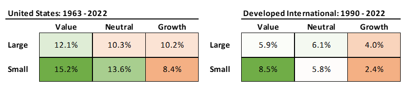
Source: Ken French data library
Overall, these trailing relative returns to small caps (even over the long horizon we’ve seen of late) would not have been a good reason to switch investment styles in the long history of markets. When accompanied by lower entry prices, they were typically times to stay the course or add, for those market participants with the ability to invest that way.
The other possibility is that something has structurally changed with small caps relative to large caps. It’s possible, but we doubt it. We spent a significant amount of time in 2018/19 and early 2020 addressing the myriad hypotheses claiming the demise of the value factor for structural reasons after a similar horizon of underperformance ending in a brutal relative drawdown. Then as now, we’ve found the most relevant factor for explaining the past and making long-horizon forecasts about the very uncertain future seems to have been changes in the entry price.