The Best Macro Indicator
Why You Should Be Following High-Yield Spreads
By: Verdad Research
We have written extensively about the importance of the high-yield spread as a macro-economic indicator. And we have detailed how investors can rely on the level of the spread (i.e., wide or narrow, above or below its historic median) to generate excess returns in our Crisis Investing and Countercyclical Investing papers.
Today, we wanted to elaborate on important new research that we have done on how use the high-yield spread as an investment indicator. We update our previous work to show how the direction of the high-yield spread (i.e., rising or falling) adds value to simply using the level of the spread alone. We show that the level and direction of the spread predicts returns not only in small-cap value equities, but across the full range of assets that most investors hold.
As a reminder, the high-yield spread measures the difference between the borrowing rate for below-investment-grade corporate bonds (typically issued by small, cyclical companies) and the corresponding US Treasury spot rate. You can track the high-yield spread in real time on the FRED website. The spread is a real-time indicator of investment flows, with lower spreads indicating easily available money for investment and higher spreads indicating tighter credit conditions and often fund outflows from risky assets.
The table below shows the current level of the high-yield spread versus the trailing three-month change in the high-yield spread and how it predicts the next month’s change in GDP and inflation.
Figure 1: 1M FWD Quarterly Change in Growth Rate and Inflation (1970–2020)

Source: FRED, Verdad. Calculated on a quarterly basis per GDP reporting cadence.
We define the four stages of the business cycle as follows:
(Quadrant 1) Recovery: Growth booms as the economy is restarted. Inflation falls as a result of consumer and central bank behavior in recessions (end of previous cycle).
(Quadrant 2) Growth: The economy enters a sustainable growth period, triggering inflation.
(Quadrant 3) Overheating: Growth slows and inflation further increases.
(Quadrant 4) Recession: Growth is negative, as is inflation, given reduced consumer spending and rate cuts by central banks.
Relying on the level and direction of the high-yield spread seems to be a powerful leading indicator of business cycle progression. We see this model as complementary to the predictive model we developed in Countercyclical Investing. For example, a wide high-yield spread would trigger the countercyclical model to allocate toward small value and S&P 500 stocks, which are top performers in recoveries (see Figure 2 below). However, accounting for the direction of the high-yield spread would help the model further categorize periods with wide high-yield spreads as recoveries and recessions, thus potentially avoiding the S&P 500 underperformance in the latter. When high-yield spreads are narrow, the direction of change provides similar information as the slope of the yield curve.
Below we show annualized three-month forward returns of key asset classes by estimated cycle stage.
Figure 2: Annualized Average 3M FWD Returns (1990–2020)
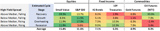
Source: Bloomberg, Capital IQ, FRED, Verdad
The table above is aligned with our findings on asset class performance by economic environment in Countercyclical Investing. By far the most important signal here is the remarkable outperformance of small value equities (+39.3% annualized return!) in the recovery phase, when spreads are wide and falling (quadrant 1). This is the basis of our paper Crisis Investing and much of our earlier work on high-yield spreads. The above table again highlights how powerful this relationship is.
We also see other confirmatory evidence of economic relationships that we previously highlighted in Countercyclical Investing. For example, we see that fixed income, ten-year Treasurys in particular, and gold outperform the S&P 500 when spreads are wide and rising (quadrant 4). We see that bonds meaningfully underperform when spreads are falling (quadrants 2 and 3) and the most cyclical assets (oil and stocks) are doing well. At the same time, the high-yield spread signals offer additional insights that did not stand out in our previous research. For instance, the S&P 500’s strongest performance comes at the end of a cycle, when the economy is overheating and spreads are low and rising (quadrant 3).
Importantly, these signals are based on trailing data, with no foresight bias. Investors could easily rely on the relative level and direction of high-yield spreads to support their asset allocation decisions. The chart below provides a visualization of the business cycle, the high-yield spread signals, and suggested assets to own in each cycle (not limited to the illustrative asset classes shown above).
Figure 3: Real GDP Growth, High-Yield Spread Signals and Top Performers by Business Cycle Stage

Source: Verdad
A Strategy Based on High-Yield Signals
We sought to test the high-yield spread level and direction signals in a strategy that would shift asset allocation based on predicted cycle stage and associated expected returns of each asset.
To keep it simple, we propose a strategy that would overweight equities and diversify into oil at the beginning of the cycle (i.e., in recovery and growth stages) and increase allocation to fixed income and gold towards the end of the cycle (i.e., in overheating and recessions). Below we show the proposed weights by asset and business cycle stage.
Figure 4: Asset Allocation by Business Cycle Stage

Source: Verdad
We have tested this strategy against the three properties of a successful strategy, as defined in Countercyclical Investing: 1) outperform a 100% equity approach in terms of total return; 2) achieve drawdowns comparable to a 60/40 portfolio; and 3) exhibit consistency of returns across macro-economic condition, with no “lost decades” (i.e., no significant stretches of time with zero or negative real returns).
Below we show the performance of this dynamic strategy compared to a static one (i.e., a buy-and-hold portfolio weighted as per the historic average), an “all equity” approach, and a 60/40 portfolio.
Figure 5: Key Performance Indicators by Strategy (1990-2020)

Source: Verdad
These results suggest that the strategy passes the first two tests: it would have had higher returns and lower drawdowns compared to both an “all equity” approach and the 60/40 portfolio. Interestingly, relying on the high-yield spread level and direction signals would have contributed over 450bps in returns compared to a static portfolio that would have allocated to the same asset classes at average weights.
We made the third test of “no lost decades” more rigorous by looking at five-year stretches. Below we show compound returns by five-year periods since 1990 for our strategy, the “all equity” approach, and the 60/40 portfolio. We compare them with the rate of inflation over the same periods and highlight those with zero or negative real returns.
Figure 6: Compound Returns by Period and Strategy (1990–2020)

Source: Verdad
The dot-com bubble in the early 2000s and the great financial crisis of the late 2000s resulted in a lost decade for the 60/40 portfolio and the S&P 500. The above results suggest, however, that a strategy based on high-yield spread signals could have avoided these poor returns. On the flipside, the strategy would have underperformed in the bull market of the last decade.
The above table confirms that, similarly to Countercyclical Investing, this strategy is rewarding investors when they need it most: in bad times. This is not surprising, as both strategies rely on high-yield spreads as their main signal. But does this strategy outperform in those periods only? To answer this, we looked at how the returns for our strategy, the 60/40 portfolio, and an “all equity” approach compare by business cycle stage.
Figure 7: Annualized Average 3M FWD Returns (1990–2020)

Source: Verdad
The strategy seems to indeed outperform most when cycles turn (i.e., in recessions and recoveries). However, it is also a top performer in good times, when the economy stabilizes, generating returns significantly above the 60/40 portfolio and at par with the S&P 500. As expected, the strategy underperforms slightly when the economy is overheating as the model starts reallocating more to fixed income and thus misses part of the final equity bubble stretch. However, this conservative approach is generously rewarded in subsequent recessions.
Conclusion
If US investors could only use one macro indicator to inform their investment decisions, we feel that indicator should be the high-yield spread. It is a compound measure that combines both the pricing of risky assets (i.e., corporate debt), which is sensitive to risk appetite, and “risk-free” assets (i.e., Treasurys), which are sensitive to expected growth. So a declining spread can reflect more appetite for risky assets, rising growth expectations, or both, and vice versa. In our view, this makes the high-yield spread such a robust indicator of the business cycle.
A signal based on the level and direction of the high-yield spread could be useful to estimate business cycle progression and, in turn, inform asset allocation decisions. A strategy based on high-yield signals would have outperformed the 60/40 portfolio and an “all equity” approach by a significant margin over the last 50 years.
This strategy also accomplishes the three key goals of countercyclical investing: higher returns than 100% equities, lower drawdowns than a 60/40 portfolio, and no lost decades. In addition, this strategy is relying on the S&P 500 as a diversifier, given its relative performance is negatively correlated with the S&P 500’s absolute performance.
It is worth noting, however, that this investment strategy would require frequent and significant changes in portfolio allocation. Reducing turnover is thus one of many execution constraints investors must consider and solve for implementation.