Diversification, Correlation, and the Business Cycle
How growth and inflation drive returns and correlations
By: Verdad Research
The traditional 60/40 portfolio is designed in part on the premise that stocks and bonds are negatively correlated and thus that fixed income can be a consistent diversifier for equities.
But, statistically, the correlation between stocks and bonds has been far more volatile than this simple premise might suggest. Below we show the monthly returns of Treasurys plotted with the contemporaneous monthly returns of the S&P 500.
Figure 1: Monthly Returns of S&P 500 vs Treasurys (Jan 1929 – Present)

Source: S&P Capital IQ, Verdad analysis
There are months when returns to the S&P 500 and Treasurys have been negative and other months when returns to both have been positive. The data highlight some extreme outcomes. For instance, we see one month where the S&P 500 dropped -5.7% and Treasurys -2% but another month where the S&P dropped -7.1% and Treasurys jumped 3.6%. And these correlations have not been stable over time. In the 1970s, correlation was 9% while in the 2010s it was -39%.
Relying on these historical correlations is not good risk management, as these correlations are unstable and can be mere statistical artifacts of historical relationships rather than fundamental truths about how markets work.
We believe that studying the business cycle—and understanding how growth and inflation impact asset class returns—offers a superior approach to understanding the variance in performance between asset classes and factors.
Our approach focuses on using the high-yield spread as a systematic indicator for understanding the level and trend of growth and inflation and thus the business cycle. Though timing factors is difficult, research indicates that using systematic frameworks—namely the information contained in high-yield spreads—can improve decision making. This is true for both forecasting macroeconomic environments and for tilting factor exposures.
Figure 2, which shows the returns of the S&P 500 and Treasurys by business cycle stage, helps us understand the historical variance in returns to the two asset classes. We divide the business cycle into four stages: periods of rising growth and falling inflation (high yield spreads wide and falling), periods of rising growth and rising inflation (spreads tight and falling), periods of falling growth and rising inflation (spreads tight and rising), and periods of falling growth and falling inflation (spreads wide and rising). Each chart shows average return during each of these regimes, bounded by a 95% confidence interval.
Figure 2: Average Monthly Returns by Business Cycle Stage with 95% Confidence Interval, S&P 500 & Treasurys (Jan 1929 – Present)

Source: Bloomberg, S&P Capital IQ, Verdad analysis
The relationship between equities and treasuries and the mechanics of the 60/40 portfolio become evident when viewed through a business cycle lens. In quadrant 4, when growth and inflation are falling, Treasurys offer their highest returns. Contrastingly, in quadrant 1, when growth is increasing and inflation is falling, the S&P 500 offers its highest returns. The twin goals of capital appreciation and preservation are achieved because the two assets have different sensitivities to the business cycle.
These results bear a simple explanation. It makes sense to own different assets not because of the trends in their historical performance but because of how they fare in differing economic environments. With a drivers-based view of the world we understand that the outperformance of asset classes is driven by sensitivity to changes in the rates of growth and inflation and not merely by static correlations or other trends in recent performance.
One consequence of a drivers-based view of assets and risk is that investors can diversify sources of beta and increase the opportunity for alpha through the dynamic selection of exposures. Figure 3 shows returns to oil, copper, and the JPY/USD FX rate throughout the business cycle.
Figure 3: Average Monthly Returns by Business Cycle Stage with 95% Confidence Interval, Oil, Gold, Copper, JPY/USD (Jan 1979 – Present)
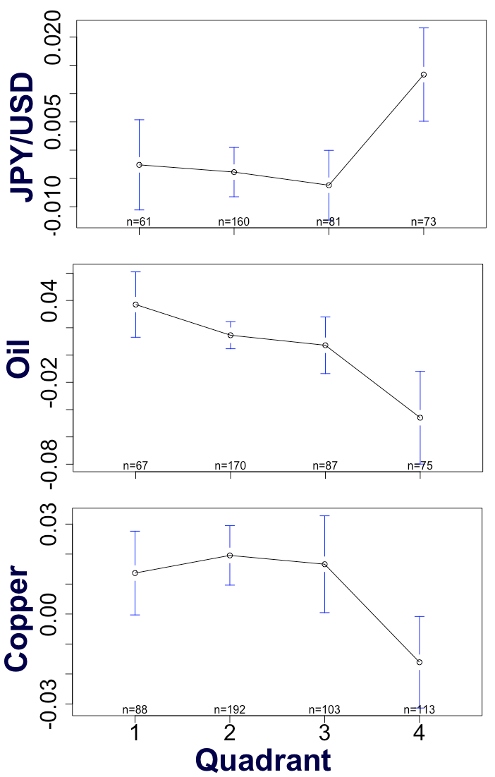
Source: Bloomberg, S&P Capital IQ, Verdad analysis
The data show that oil offers reliably positive returns in quadrants 1 and 2, in periods of increasing growth; that gold offers its highest returns in quadrants 1 and 4, during periods of deflation; that copper offers positive returns in quadrants 1, 2, and 3, but negative returns in quadrant 4 when both growth and inflation are falling; and that the yen offers very attractive returns in quadrant 4, when both growth and inflation are falling. Thus, when growth and inflation are declining, the 60/40 investor could substitute some of their fixed income exposure for JPY/USD and gold. Similarly, when growth and inflation are increasing, instead of holding a pure equity portfolio, 60/40 investors could pick up exposure to copper and oil.
The ability of the business cycle to describe return variance is evident in factors as well. Figure 4 shows the average monthly returns to the small value factor throughout the business cycle. Small value works best in quadrants 1 and 2, during periods of increasing growth.
Figure 4: Average Monthly Returns by Business Cycle Stage with 95% Confidence Interval, Momentum, Large Profitability, Small Value (Jan 1963 – Present)

Source: Fama French Indices, Verdad analysis
In sum, the business cycle offers greater stability and interpretability to the behavior of asset classes. Investors can both diversify their beta exposures away from pure 60/40 allocation mix and increase their ability to generate alpha through dynamic selection of asset classes as the economy transitions through different phases of growth and inflation. Although, as the conventional wisdom goes, stock market history never repeats itself, it does rhyme when examined through a business cycle lens.